 Who's saying what 
|
Friday, September 2, 2011 1:05 AM
Week 5 Progressive Submission: Image of wirefame POSTED BY ASHLEYCHEWXUELIN 
Friday, August 26, 2011 12:42 AM
Week 4 Progressive Submission POSTED BY ASHLEYCHEWXUELIN The main objective for the revamp of the website is to make it more organised and look more professional. Site Diagram 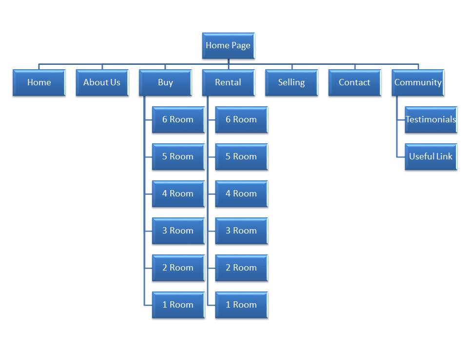
Wireframe 
Visual Elements Logo Theme colours 
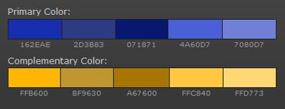
This is the colour range of the theme for the website. Since Bali is known as the resort island, therefore I am using blue to represent the beach and sea. And another reason is, darker colour will look more professional than bright colours as bright colours often represent young and lively. Yellow is a complenment colour of the theme. Navigation for the website   
Search engine 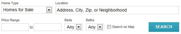
This function allows the customer more effectively to find their desired property and agent Slideshow image 
This will right away let the user know what is the purpose of the website. And also attract potential customers. Sunday, August 14, 2011 7:46 AM
Week 3 Progressive Submission: Web Analysis POSTED BY ASHLEYCHEWXUELIN Website: http://www.ptbalirealestate.com/ The purpose of the website This is a Bali real estate listing website. The purpose of the website is to help and speed up for people who are looking for a property in Bali, to provide a listing with the prices, space and city/state of the property. It allows user to buy, sell and rent the property. The audience The website is targeted for wealthy foreigners who are moving to Bali to stay either in short or long term most likely 27years old and above. From the pictures shown in the website, they aim to attract Caucasian, like businessman or for their retirement. Website design critique In general, the home page is unorganized. The layout of the website is very messy. The navigation of the website is not clear enough for the user to understand, furthermore there is repeated category in the navigation. To add on, there are errors for the position of the lines and pictures which make it very disordered. Pictures on the page are very pixelated and not clear, repeated same information for more than two times randomly in between texts. Colours and font used are not consistent resulting to be very confusing. Secondly, there are a lot of errors in the navigation. Some of the navigation does not have any function or brings you to an error page. After you click onto the no error navigation, it will bring you to another totally different design page where the navigation moves to the left side of the screen. The navigation on the page have completely different fonts, colours, design and the set of category listed in the navigation as on the home page. And everything is just very mess up, for example the home page the navigation “Current Bali Listing” is the same page as “Bali Villa Rentals” on the navigation page. 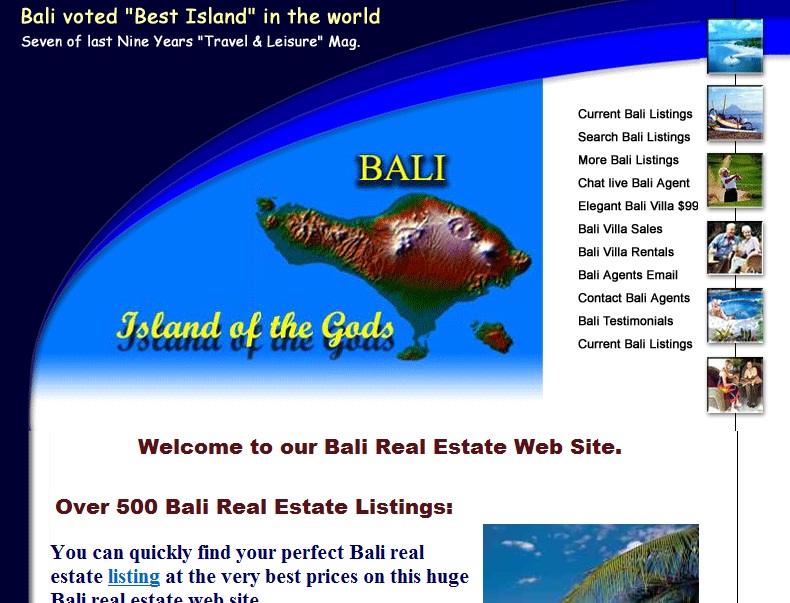 
Then again, the information they provided are not reliable. From the home page, “To rapidly find your ideal Bali real estate you may contact our Bali real state consultants by email, live chat, skype telephone or fax to answer your Bali real estate”They did not provide the information clearly, for the email address, skype telephone and fax number. The email address and skype number was provided through clicking on the linked images, it can be very misleading as it looked like advertisement images or link. However, the telephone and fax number information are all jumbler up. There is no specific place or category to put all the contact details together. 
Information like“Recent Bali Villas for Sale”, “Recent Bali Rental Properties”, “Bali Real Estate News”, “Most Bullish North Of Sanur”, “Award Winning Estates”, “Contact Us” and are all over the place in the home page, it is very hard to understand and read the details. In summary, the website does not look appealing to the target market as it is not professional looking and looks very unreliable company. And bad organization of the website reflects very badly on the company because maybe after the client buy property from them that can disorganize and slow down or even ruined the whole project. There is no featuring of the company or organsation name, I assume it is called PT BALI as the logo was shown on the page after you click onto the navigation page. Revamp of the website To improve the website, first the company has to do a mindmap of what they want to include in their website. Next, is to choose a theme with consistent colours, fonts size & style, designs throughout website and have a fix layout of the whole page. Theme and layout must be classic nothing too fanciful as it will bring out the professionalism. List down a proper list of category to include in the navigation, it is important as it helps to organize the information properly. Allocate a page or corner for the contact information and detail, as for a real estate company the most vital thing is their contact details. Pictures should be of more high resolution, at least should be clear. For the Bali Villas listing, pictures of the place should be included in the charts as it will speed up the finding and help the buyers to have a better view of all the real estate which is available in the website. The message and words they use must more understandable and convincing because even with the testimonial they had provided looked not reliable or even people might think that it is a scam company. With relevant message and pictures provided, it will not only help people to understand more about them but it will help the company to attract more potential customers or businesses. Featuring the company name and logo is as important, therefore people recognize the company well and build up their name through the website. Thus, the website will be organized and more effective in bringing their message across, creating a better visual view in terms of designs and therefore attract customers and business opportunity. |
Affilations  EricaShiminCherylTamPriscilla EricaShiminCherylTamPriscillaSchool NAFA Class Update Edmodo Search |
Name: Chew Xue Lin, Ashley, Class: FMM5B2
Created by Ashley
in 2008